
My contribution to the 2026 BOLD Festival, the fifth directed by Liz Lea, was a paper on design for dance with a particular focus on two artists, Mikhail Larionov and Kristian Fredrikson. I was especially interested in the work of Larionov and Fredrikson on this occasion because material relating to them both is held in Canberra. In addition, I was interested to look at whether or not there was some form of dissent relating to their works for dance, given that the concept of dissent was of interest as part of the Festival, which was developed in 2026 as part of Craft + Design Canberra Festival
My talk was accompanied by a PowerPoint presentation but I have included here just a few images. The PowerPoint is attached at the end of the text for those who would l8ke to see all the images. The text below is a slightly shortened version of the full text.
Below on the left is a portrait of Larionov (1881-1964) and on the right of Fredrikson (1940-2005).
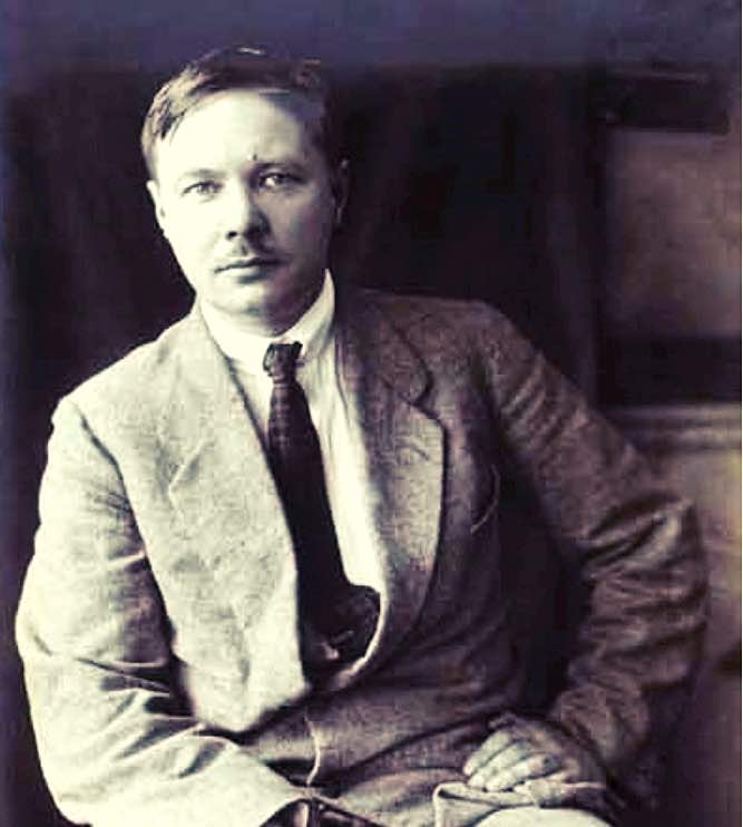
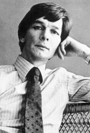
Dance and design. From Mikhail Larionov the Kristian Fredrikson
Paper given by Michelle Potter, 13 November 2026. Canberra Museum and Gallery
In this talk I would like to discuss some of the designs for dance from two artists, Mikhail Larionov and Kristian Fredrikson. I am especially interested to talk a little about them because they have their work represented here in Canberra: Fredrikson in particular has an enormous amount of material located in the National Library of Australia (NLA).
I’ll talk first about Mikhail Larionov, a Russian-born artist who studied at the Moscow School of Painting, Sculpture and Architecture. He is generally regarded as an avant-garde artist for his time—in fact he was suspended three times during his course at the Moscow School for his radical outlook. He established a form of art known as Rayonism and in his writing he noted: ‘Long live the style of Rayonist painting created by us free from realistic forms, existing and developing itself only according to its own pictorial laws.’ The ‘us’ in that quote refers to him and his long-term partner Natalia Goncharova. Larionov also established performance art in Moscow before moving to Europe in 1915 with Goncharova.
For this talk, however, I want especially to focus on Larionov’s work with Diaghilev and the Ballets Russes so I will leave his non-dance and performance art career in abeyance, although, of course, it is sometimes a bit hard to separate dance and performance art. He is not especially well-known as a designer for dance, largely because he wasn’t frequently active in that area, and because the works he did design were mostly not long-lasting repertoire additions. But he was invited by Diaghilev in 1915 to design a ballet that was eventually called Chout. I eventually discovered that c-h-o-u-t is the French spelling of the Russian word S-H-U-T, which means (according to where you look) buffoon or jest or prank. I haven’t yet been able to establish why Diaghilev was interested enough to set up that invitation but the ballet, which was based on an old Russian folk tale, and which premiered in Paris in May 1921. It was performed to a score by Prokofiev, which had also been commissioned by Diaghilev.
The historian Richard Buckle writes that Chout was ‘a farce whose violence—even cruelty —was echoed in the mocking dissonance of Prokofiev’s score.’ But in slightly less dramatic words, the ballet concerns a young village buffoon who, while wielding a so-called magic whip, tricks his colleagues into believing that he has killed his wife and has brought her back to life with the whip. Seven other buffoons believe the story and buy a magic whip. They kill their wives and then discover that they cannot bring the women back to life. In order to escape from the seven older buffoons, the young buffoon disguises himself as a female cook.
In the meantime, a merchant who has been invited to select a bride from the daughters of seven older buffoons chooses the disguised young buffoon, the apparent cook. The so-called cook escapes and leaves a goat in his place whom the merchant kills. The young buffoon returns minus his disguise as the cook and accompanied by soldiers. He demands that the cook be brought forward or that he, the young buffoon, be compensated by the merchant. The ballet ends, since the cook can’t be brought back, with the young buffoon and his wife being compensated (perhaps somewhat unfairly?) and going on to celebrate their new prosperity while the soldiers woo the daughters of the seven buffoons.
Three costumes from Chout were acquired by the first director of the National Gallery of Australia (NGA), James Mollison, from an auction house in London and have been on public display one or two times. Two are shown below: the one on the left is Larionov’s costume for the Buffoon’s Wife, and the one on the right is the costume for a soldier.
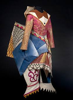
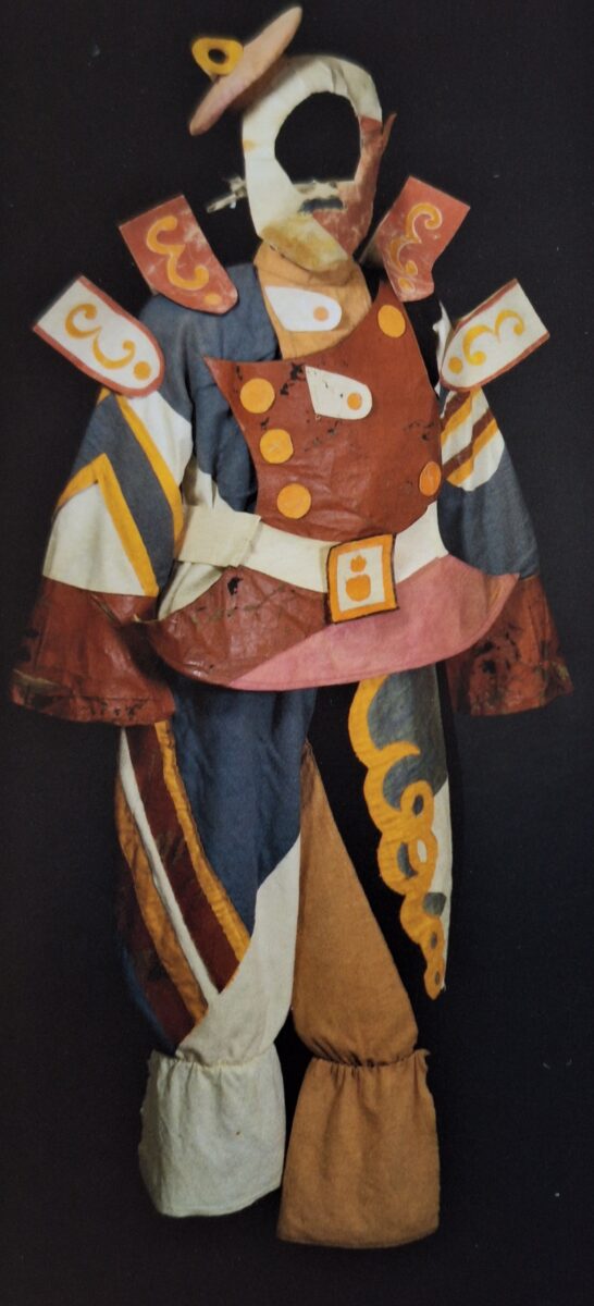
So, what can we surmise about the costumes? The most obvious noticeable feature is the huge amount of detail, often cubist or geometric. Then, although we can’t tell from photographic imagery, the second issue of interest is what we can glean about the materials used to create the costumes. This information comes from written descriptions of the items once they have reached a home in a gallery or museum. The NGA, for example, says of its Chout collection:
Echoing the vividly coloured Cubist scenery graphics, the costumes’ abstracted angular shapes and patterns and flattened, almost deconstructed forms made the dancers a moveable part of an overall scenario. Although based on the conventions of peasant clothing, some of the costumes were visually extended with stiffened buckram, felt, rubberised cloth and heavy cane structures, hindering movement to the extent that the dancers feared that they could not carry out the planned choreography, and causing Diaghilev to enforce their contracts in the face of a strike.’
The strike concerned largely the extreme weight and restrictive nature of the design of the costumes. The complaints also centred on the feeling that the costumes put exceptional strain on the body, that they limited the dancers’ ability to manoeuvre their bodies properly, and that they rubbed their skin raw and developed cuts to their feet and legs. Lydia Sokolova, who danced the role of the bride of the young buffoon, is quoted as saying of Larionov’s costumes:
Although the costumes were vivid in colour and wonderful to look at, they were appallingly uncomfortable. All our abandon and zest for dancing was nipped in the bud. We had horrible thick pads tied around our waists, then there were tight, heavy costumes on top of them. The tall, mitre shaped Russian head-dresses, once they had slipped slightly to one side, just refused to stand up straight again
Sokolova has also been reported as saying ‘I felt there was no real dancing I could get my teeth into’ and also that her costume was ‘hell to dance in’. And incidentally the choreography was by Larionov, although he was assisted by Tadeo Slavinsky, a Russian-born dancer who performed with the Diaghilev company and who came to Australia with Pavlova and then Colonel de Basil and eventually went on to dance in Australia with the Borovansky Ballet.
Then the esteemed early 20th century critic Cyril Beaumont says of the costumes in relation to the setting that ‘the effect on the eyes was almost irritating’ and likened the whole scene as having ‘those flickering streaks of coloured light so characteristic of early colour film’. Of the costumes themselves Beaumont has remarked that some ‘exceeded the limits of fantasy when some of the women wore high-heeled satin shoes with their peasant dresses.’
Kristian Fredrikson
Now I’m just going to leave Larionov and Chout for the moment and move on forty or so years and talk about another designer, also working for ballet productions—Kristian Fredrikson.
Fredrikson was born Frederick John Sams in 1940 in Wellington, New Zealand. He began his adult life as a cadet journalist with Wellington’s Evening Post, first as a copy holder, then as a reporter, and later as a theatre and music critic. As a critic, he occasionally also covered ballet and wrote book reviews. The usual byline he used at that stage was ‘F.J.S.’ He played around with his name for a few years but by 1962, when he was working for another newspaper published in Wellington, The Dominion, his press pass was issued to a Mr Fredrikson and was signed K. A. Fredrikson (Kristian Adrian Fredrikson). He came to Australia at the invitation of Peggy van Praagh in 1963 in order to work on designs for an early Australia Ballet production of Aurora’s Wedding. Although he returned to New Zealand quite often, his career as a designer, which lasted right up until his death in 2005, largely unfolded in Australia, with a stint in Houston, Texas, at the invitation of Stanton Welch, then and still director of Houston Ballet. This Houston experience was part of an ongoing connection with Welch who, while working in Australia, had used Fredrikson as a designer for several of his works.
Fredrikson’s career included works for dance, theatre, opera, film and television and he created designs for around 150 productions. His manuscript material, which includes an extensive collection of designs, is held here in Canberra at the NLA. He was designer for around 150 productions over his lifetime.
As well a designing, Fredrikson frequently wrote about his design approach. He said on one occasion for example, ‘The designer is first of all an analyst able to interpret the personality and environment of fictional characters and give them a human condition, i.e. give them a past and a future which will communicate itself almost subliminally to the audience. Such comments were the reason perhaps behind the remark made at one stage by the Australian Ballet principal Gailene Stock that his costumes were inspirational to wear: you thought you were the role. Fredrikson, perhaps unlike Larionov, was clearly a designer at heart. If we look further into his designs, we can see that very often he made patterns very clear and often designed accessories for his costumes.
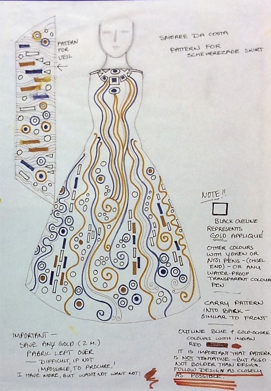
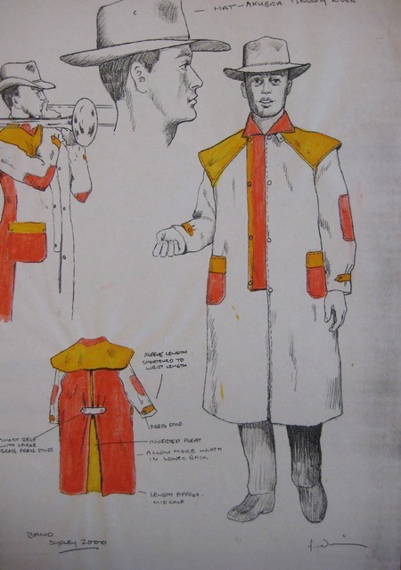
The design on the left is for one of the dancers in Graeme Murphy’s Shéhérazade, which Fredrikson designed for Sydney Dance Company in 1979. Like all of his designs, it is full of instructions, including not to throw away any leftover gold material as it was difficult to find and buy. On the right is the costume design for the men of the Marching Band in the Sydney 2000 Olympic Games.
Fredrikson clearly thought of himself as a designer rather than a visual artist, although of course he was both. But he did write on an undated and untitled note in his collection at the National Library, ’As far as I am concerned, I will probably design until I drop.’ And in fact he did as he was in the throes of design Swan Lake for Houston Ballet when he died in Sydney in 2005. As a designer he carried out extensive research for the works and characters for which he was commissioned to design. His papers are full of research materials into various eras and the fashions of those eras, not to mention the fashions worn in different circumstances within those eras.
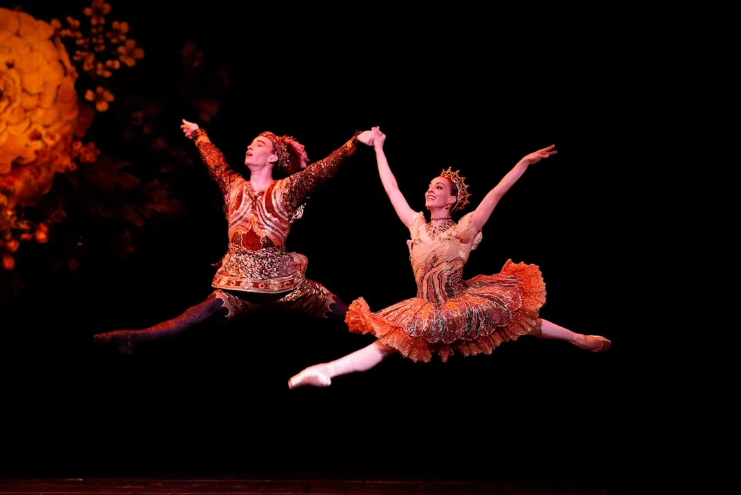
Fredrikson was always concerned with choosing the correct fabric for his costumes, especially with regard to how they would feel on a dancer’s body. As a result, there is very little comment to be found from dancers about how the costumes felt. In fact in my research I found very few moments of dissent from performers. One came from Australian Ballet dancers Miranda Coney and Greg Horsman about the costumes they wore in an Australian Ballet production of Nutcracker. Coney and Horsman mentioned they had a little trouble with their headdresses when dancing together as the plume of feathers on Horsman’s headdress kept getting in the way of Coney’s tiara. You can see the tiara and feathers in the image below.
There were also a few grumbles from the chorus in a production of The Magic Flute made for Wellington City Opera. It seems that the costumes were of a wide triangular shape and the performers had to go sideways through doors and were constantly bumping in to each other.
Conclusions
So what am I to conclude at this point? Basically there have been two ways of looking at design for dance in my talk. Larionov regarded himself, I believe, as a visual artist. His designs reflected his practice as a visual artist and his interest in current and new trends. His designs did not really reflect the fact that they were costumes for dancers to wear in performance. As a result there was dissent amongst the dancers who cared mostly about dancing the choreography that was set for them to do.
On the other hand, Fredrikson regarded himself as a designer and he was constantly looking for the best way to create costumes for individual works. There were few issues that aroused dissent amongst the dancers. On the other hand, he was consumed by a feeling that he needed to dissent if his role in a given production was not adequately recognised. Dissent in this case was not so much from the dancers as from the designer himself.
************************
There is a lot more I could say of course but I will finish by saying the designer I would love to look at in greater detail these days is Akira Isogawa. Those of you who may have seen the single show of Melanie Lane’s MOUNTAIN that was shown here in Canberra a few weeks ago may have been taken by Isogawa’s costumes for that production. I was especially interested in the variety and by the unusual aspects of costumes, but also by the fact that not only did the dancers appear to find them easy to work in but that they had us thinking across the entire 6o minutes of the show about why the costumes were changing and what they each represented.
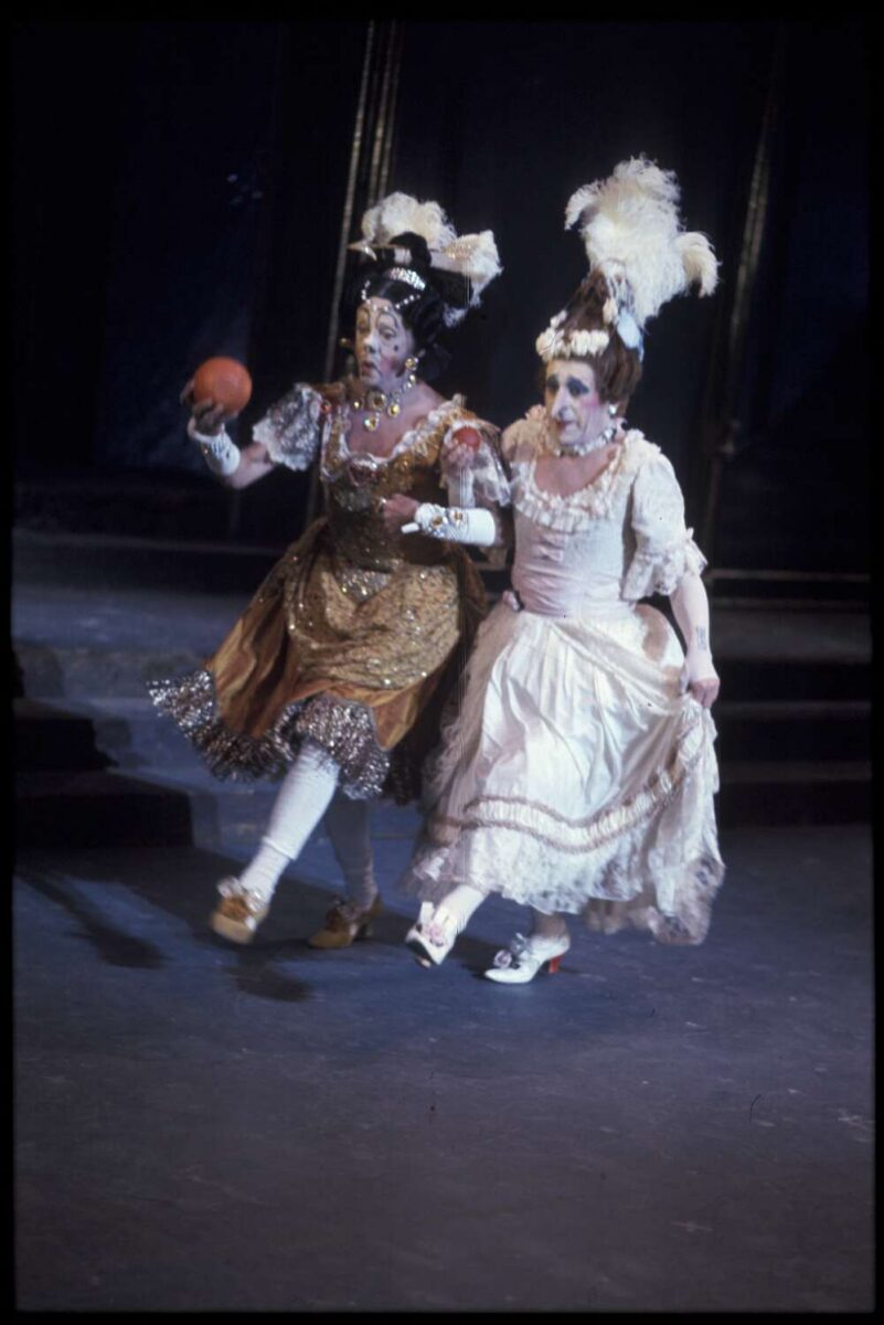
But to conclude…enjoy this image of Robert Helpmann and Ray Powell as the two Step-sisters in the 1972 Australian Ballet production of Cinderella. The costumes were designed by Kristian Fredrikson.
Here is a link to the full PowerPoint presentation. Thanks to the incredible input of the BOLD director, Liz Lea, the BOLD Festival has become an integral part of the dance world in the ACT and across Australia, also with strong international connections.
Michelle Potter, 18 November 2026
A note: the header image to my PowerPoint did not include a portrait of me, as did the PPTs of others. I preferred to use an image of my foot in dissent as it endured an attempt to push it into a pointe shoe that was too small.